The landscape is changing in search and it is happening real fast. Mobile search is the Now! This group interview is inspired by Dr. Pete’s post on Moz entitled, Why Mobile Matters – Now.
In addition, Here’s Nielsen’s report last February 2014 stating that
“The ownership of mobile devices is revolutionizing the consumer shopping experience. Increasingly, consumers are relying on mobile devices to research potential purchases and compare prices for goods and services. As U.S. consumers continue to take advantage of the convenience of anytime, anywhere browsing and shopping via their smartphones and tablets, there is a huge opportunity for retailers and brands to capture the full path-to-purchase.”
Given the data above, mobile SEO is definitely something, we, SEOs and inbound marketers should take SERIOUSLY to evolve with moving forward or else, we become dinosaurs in our own field. As such, I’ve asked 14 Influential SEOs in our community on what’s their take on mobile search engine optimization.
Here is my question:
What are your top three mobile search optimization tips to adapt on the impending mobile search/usage surge?
Rand Fishkin Ann Smarty
Gianluca Fiorelli Tadeusz Szewczyk
Duane Forrester Aleyda Solis
Dan Shure Nick Eubanks
Jason Acidre Peter Attia
John Doherty Kane Jamison
Martin Reed Brian Dean
14 Influential SEOs on Mobile Search Engine Optimization
Rand Fishkin – Co-founder of Moz and Inbound.org
1. Ensure that you not only leverage responsive design so your site/pages look great across all platforms and devices, but that you’re also thinking specifically about which content should appear front and center for mobile users (who may have different information/task needs than desktop users).
2. Be ludicrously fast. The speed expectations on mobile are growing, and are already at an almost-unreasonable level. Those who can create pages that fly to a mobile device’s screen have the best opportunity to retain and please their visitors.
3. Expand your keyword and content universe to consider all the ways mobile users might search for solutions related to your product, your content, or your expertise. Being there at the right time can provide immense benefit.
 Gianluca Fiorelli – Owner of ILoveSEO.net
Many SEOs forget to ask themselves: Is responsive the correct solution for my site?
If you think quietly, maybe you’ll discover with surprise that using responsive design may be not the best solution for your business. It is true that is the solution Google prefers (having just one URL to crawl and store in the index instead of two is beneficial for Google in terms of server costs), but has a looped-issue:
Google prefers responsive > But responsive can harm the performance of the site > And Google doesn’t like “slow” sites, especially on mobile > But Google prefers responsive > and the loop continues.
For this reason I tend to be prudent when I hear clients urging for implementing a responsive design.
Maybe it is better to create and optimize a mobile site (m.domain.com), so that you can optimize it for those displays that really are offering you the best metrics.
Or, maybe, it is better taking into consideration Adaptive design, which is usually confused with Responsive but that is completely different in its purposes. Responsive adapts a site to the pixels of every screen. That means a lot of code, css et al, hence the PageSpeed slowdown.
Adaptive, instead, consciously define what to show of the site for a certain set of screen-size. In this sense it’s more streamlined and – because you are not showing all the site in every platform – it makes the mobile user experience a better one.
I usually says that Adaptive design let you treat your website as it was an App, because you really can decide – over the base of user data retrieved via Google Analytics and tests groups – what content is really used on the different mobile sets (smartphone, phablets, tablets). For instance, people just use the “reservation form” in a restaurant’s site when on mobile, while maybe consulting menu and/or the searching for its phone number and address. With adaptive design you can decide to show users just those content, and so being more useful and obtaining a better ROI. With Responsive you would be pushing everything to the users, also those things that data tell you aren’t working on mobile.
 Duane Forrester – Runs the Bing Webmaster Program – Sr. Product Manager at Bing
1. Speed matters – the network will suck up time, so you need to be fast, fast, fast or users will think the issue is with your site.
2. Usability matters as much, ore more, on mobile devices. Don’t be that site w/mouse-over navigation for a mobile user.
3. Stick with responsive design; avoid m-dot domains – test, test, test – mobile means tablets & phones; you won’t know which.
 Dan Shure – Owner/Consultant of EvolvingSEO.com
1. Segment search traffic to mobile/tablet only. Surprisingly a lot of people don’t do this. But there’s a lot of insight you can get from this basic segmentation.
For instance, you can then sort landing pages by page load time, and find the slowest pages on mobile devices. Then fix whatever is causing the slow load time for those specific pages.
You can also use this segmentation to identify pages that get higher bounce rate on mobile from search. When looking at bounce rate, do it as compared to the site average. Raw bounce rate it good, but this will be relative to your site
as well.
I emphasize that you should do this segmentation for search traffic only, because it’s one way to see what Google might be seeing (and users!) from search results. These metrics are important because Google is taking site speed and possibly “bounce back to SERP rate” into their rankings.
2. Make use of the User Experience test in Google’s PageSpeed Insights tool. For example, here’s a random check of Warby Parker, http://developers.google.com/speed/pagespeed/insights/?url=www.warbyparker.com – As you can see, their mobile site is pretty well optimized for UX according to this tool.
3. As I mentioned in the comment on Dr Pete’s post, Google is now indexing Android Apps right in Google Search on mobile devices. If you have an Android App you should make sure to get it indexed: https://developers.google.com/app-indexing/ – I think this is going to be more important as App Indexing develops.
Hypothetically, there may be a day when you can search for iPhone Apps with Duck Duck Go in Safari on your iPhone. I’m just making that up, but don’t think it’s that far fetched. App indexing is something to keep an eye on!

Jason Acidre- Author of KaiserTheSage.
1. Serve a different version of your site’s key pages’ content for mobile users. Mobile users are known to have shorter attention span, compared to desktop users. So making it easier for mobile-driven users to get straight to the information they’re looking for may improve the engagement rate.
2. Responsive web design – is obviously one of the methods that can help improve a site’s visibility on mobile search. But it still depends, as you also have to weigh in if having a mobile version of the site (instead of responsive web) would generate more conversions or business sales to the site.
3. Implementing Local SEO techniques, given that mobile search results may also display listings that are based on the searcher’s location (but this approach may also depend on the business model of the site being optimized).
 John Doherty – Head of marketing for HotPads in San Francisco. Founder of HireGun
First, make sure you use rel-alternate tags (in your
<head> or XML sitemaps) to tell Google the equivalent mobile-friendly page of your desktop pages. This is, of course, only when you do not use responsive design.
Second, make sure your Analytics are set up to easily gauge the differences between how your desktop and mobile sites are performing. As I wrote about in this post almost two years ago now, often mobile sites convert way worse than a desktop site, so this is an opportunity where you can improve your user experience, likely rank better (especially since Google is now telling mobile users when a page likely redirects you to the homepage), and you’ll win more business.
Third, remember that many of your mobile users will likely come either through apps or social media. Therefore, optimizing your messaging for mobile users and sending them to mobile-dedicated landing pages will go way further than optimizing a page for keywords.

Ann Smarty – Owner of SEOSmarty.com and MyBlogU.com
1. Optimize load time… I can’t say how often I dropped a page on mobile because of the slow connection. Besides, Safari reloads all pages once you launch them again (still can’t understand WHY they would do that). So the load time is crucial for mobile devices. I’d put it #1 as I can usually deal with design bugs but the load time can prevent me from ever giving that page a chance. Just make the pages fly!
2. Optimize and test your forms and calls to action (especially java and flash elements). I’ve seen so many broken drop-down menus and buttons when browsing on my phone! That, again, is more important than pretty pages: You risk losing mobile leads!
3. Make it responsive… I choose responsiveness over mobile (plain) design as it works for many designs and allows for beautiful / playful look. Overall responsive design is flexible and has long been my mobile design optimization preference.
 Tadeusz Szewczyk – SEO and Owner of onreact.com
1. The first one should be obvious by now: responsive design. On WordPress sites and other commonly used CMS systems that’s not a problem by now. You often just need to change or at least update your them. Choosing a responsive theme is by now difficult because there are so many options. I’ve been searching for one at the end of 2012 and back then was still struggling to find a good one, ideally for free. Now it’s the other way around.
You get inundated with highly professional responsive teams that resize and reorganize the content and layout based on the size of the user’s screen.
For custom built sites it’s more difficult but not impossible. I currently am transitioning my 10 year old site gradually to responsive web design. It’s challenging but also a very interesting task. I enjoy the coding so much I even consider to offer it as a service to my clients.
2. Responsive images aren’t that obvious, after all you can resize the large image can’t you? It’s a fallacy to assume that mobile users will want to see the same images or the same size of images in the first place.
Showing people on the go a smaller view of the large image with 100kb or more is really annoying when you have a slower connection.
I have made that mistake too and I am actively looking for solutions now. There are several workarounds for responsive mobile friendly images – non of them perfect yet – but I will focus more on optimizing images for mobile in the near future.
3. Responsive SEO is what I call or adapting your site on the fly depending on who uses it. Nobody knows what “user segmentation” means and thus I prefer the more self-explanatory responsive SEO moniker.
It’s about deciding what your mobile users would want to see other than when accessing your site from home or work for example.
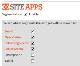
On my WordPress blog over at seo2.us, I use a combination of Google Analytics and SiteApps to segment my users and then decide what to show to them or not (see partial screen shot above). For example, mobile users won’t see my long list of topics I cover on SEO 2.0 because very few people click that list and its length would force them to scroll a lot.
I have even described the tools and process over at the Ahrefs blog:
http://blog.ahrefs.com/responsive-seo-advanced-user-segmentation-wordpress-google-analytics-siteapps/
 Aleyda Solis – International SEO Consultant and Founder of Orainti.
1. Have a multi-device friendly site, that effectively adapts your content and layout according to the type of device used, whether with responsive, dynamic serving or parallel mobile site.
2. Verify your mobile site crawling and indexing by avoiding interstitials and faulty-redirects.
3. Optimize your mobile site speed. Analyze it with PageSpeed Insights and follow Google’s speed optimization best practices.
 Nick Eubanks – Owner of SEONick.net and the current. Vice President of Digital Strategy at W.L. Snook & Associates. His current side projects include SEO Leads and Link Babel.
My top 3 mobile tips are simple, probably redundant, but still *so* under-utilized that I feel it is important to hammer then home again:
1. Make sure your website can support your #1 KPI on mobile. If you don’t have budget for a mobile landing page of responsive design, then set the viewport to zoom in on your phone number, or add a simple contact page/form with a CTA to get in touch for more information.
2. Support mobile browsing behavior. Translation: make your website thumb and scroll friendly. Buttons can (and should) be bigger on mobile devices. Long pages are OK; mobile users are used to having to scroll.
3. Leverage caching and CDN’s to speed up your pages. While a lot of mobile access is done on wifi networks, there is still plenty of users relying on mobile-broadband for their connections, and saving 100kb here and there starts to really add up on page render time and the navigability experience.
 Peter Attia – Founder of Cucumber Nebula, an inbound marketing company and Head of Marketing at Pingboard
This may be obvious, but one of my top “fixes” is using a responsive design as opposed to separate pages for mobile. It’s cleaner, easier, and less prone to send someone to an unrelated page when they click a result. People hate getting redirected to a page that isn’t what they wanted on mobile and will immediately bounce off. This is an easy negative signal for Google to pick up.
Secondly, I think it’s important to focus on Click Through Rates for meta titles and descriptions. I still often see these meta tags optimized for robots only. Mobile users make quicker decisions, because they want their information immediately. They’re typically not looking to compare or browse around. This means being the first person to be clicked can be a huge win.
Lastly, I think it’s important to focus on short and precise copy, design, and navigation. Keep things simple and easy for people to get where they want to be. People have shorter attention spans on mobile.
This isn’t an easy feat, but this can have a huge impact on conversion. It’s important to also note the conversion rate of desktop visitors if making dramatic changes to mobile. A large number of mobile users still prefer to purchase on desktop and you may not realize they already decided to convert from finding you on a mobile device.
 Kane Jamison – Founder of Content Harmony
1 – Look up top organic search landing pages in Google Analytics, filtered down to Mobile Device usage. Do the same thing in Google Webmaster Tools’ Search Queries report. Then make sure title tags and descriptions look great on mobile searches and not just desktop for each of the primarily landing pages and major mobile search keywords.
2 – If you have a site that tends to produce same day conversions (rather than one that people visit many times for months before they’re ready to purchase), split test responsive vs. desktop view against mobile conversions. It’s pretty easy to split test a master style.css file. Simply remove responsive code from one of those files, and test to see whether responsive generates a better conversion rate.
3 – Inspect all of your branded search terms on mobile. For example, brand name, your phone number, the names of your key staff, and whatever Google Instant suggests that people are search for after your brand name, for example “Dave’s burger joint menu” or “Dave’s burger joint directions”. In each search, make sure the top results are pages you control and make certain that all information is relevant and up to date. If the top rankings include something else, like Yelp or another 3rd party page, login and update everything or email them and request changes be made so that users are getting accurate information.
 Martin Reed, Head of SEO at Dejan SEO
1. Optimise for the user. Don’t squeeze the desktop version of a website onto a mobile site, trim all the noise and leave the bare essentials with a clear funnel to the user’s goal.
2. (If using a separate mobile site and not a responsive design) utilise rel=alternate markup. Let Google send traffic straight to the mobile site, don’t rely on the extra steps of a server (or browser) side redirect.
3. Reduce the payload.
Bonus: Don’t redirect all mobile traffic to the home page, redirect it to the equivalent page.
Brian Dean – Founder of Backlinko
1. Check your Google Analytics to see how much mobile traffic you get. I’m consistently surprised by how many people read “50% of all traffic is now mobile” but have no idea how many mobiles users visit THEIR site. For a lot of B2B sites, mobile traffic is less than 10% and therefore not a huge priority.Once you know how many mobile users you’re getting you can better figure out the resources to put into mobile SEO.
2. Invest in making your site insanely fast. The word “invest” is key. Slow sites are even slower on mobile. 🙂 You may need to pay a developer 40 hours to optimize code, images, databases, the works.
3. Write killer title and description tags. With author images gone, compelling title and description tags are going to get you coveted mobile clicks.
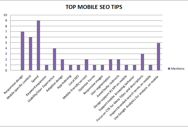
Summary:
I’ve summarized the key tips and ideas mentioned by our highly regarded SEOs using the graph below. Thank you SEO influencers for taking part on this round-up. I salute you all!